What do I need?
The information they want to give is:
- Do you love to sing?
- Join us for an exciting opportunity during the day with a professional vocal coach. Learn to sing different types of music, vocal Techniques, meet new people and have fun!
- 10.30 to 12.00 every Tuesday from 11 March
- The Community Centre, Charlotte Church Road
- £60 for the course
- No experience needed/no requirement to read music
- For more information call 011779 8765432 http://www.singout.com
Other things I might want to know:
- How many weeks does ‘the course’ run for? [A: Indefinite, no end date]
- Have you got a logo or existing identity image? [A: No]
- Is there an age limit (lower limit for unaccompanied children? They should be in school, or in bed) [A: it’s for adults – no childcare provided]
- 10.30 AM to Midday, or 10.30 pM to Midnight? [A: 10.30 am to Midday]
- Is there a target group – is this intended for middle-aged / parents / OAPs etc? [A: open to all ages – expecting to attract mums while kids are at school and more adventurous older people – it’s a ‘learning’ thing]
- Is it targetted at men or wemon or both? [A: no preference]
- Do you expect an equal response from both sexes? [A: expecting more women]
- Would you like to target just one sex? Perhaps have two ads – one for each sex? [A: prefer a mix as gives more ‘voice-type’ options]
- What payment do you accept (Cash/Cards/Cheques) [A: pay on website or by phone by card – advance payment required, no cash payment on the day]
- How do you pay/reserve a place? (Phone/Web/In person) [A: web/phone]
- Post code for the Community centre (for sat navs – and does it work for this address!) [A: Use SW7 2AP – you can’t miss it]
- When do you want to have these finished? [A: by Feb 1st to allow 1 month to advertise in advance + reproduction and distribution time]
The Black and White Format
Two-Tone
Thinking about black-and white and the design possibilities reminded me of Two-tone – a record label and a way of life for those 12 and over in 1979. I was 9 in 1979 and it kinda passed me by at the time but its legacy has gradually caught up with me. How many connotations are there in the phrase ‘Two tone’ – the Police (who used black and white checks as a trademark); anti-rascism (a big deal in UK 1979); association with Ska – which emphasised beats 2 and 4 in a way subtly different to Reggae.
Here’s a thought: if you were aged 12 in 1979 then you’d be 47 today… if 47-year-olds are the demographic being aimed at then the graphics that came with the ‘Two-tone’ record label will have a particular resonance… especially as this is all to do with singing. Although this is for all types of music not just Ska etc.
So another thought is it might be a decision to avoid this style in order not to call upon this association.
Pop Art
Pop art is normally associated with bright primary colours but underneath (or perhaps on top) is the ink – the black lines and halftoning that gave some of these works their texture and shape.
A popular way to create modern pop art is to take an image and use a ‘Threshold’ filter which creates a high contrast (the highest possible: a black and white image) rendering of the shades in the image by using a cut-off point. The cut-off value can be chosen to give the required representations.


In these examples the image has been made black and white then the threshold tool used to eliminate the shades of grey from each individual pixel. Some grey effect may still be visible because of areas where black and white pixels occur in close proximity – the human eye resolves those areas as shades.


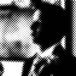
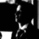

In these further processed examples a dot screen has been applied to the black and white images – this removed the ‘dithering’ and also reduces the effective resolution.
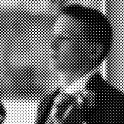
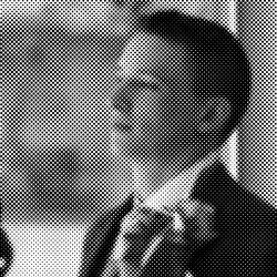
These last two images have been half toned from the grey scale (‘Black and White’) images -they look very much like the newspaper images of 1979 where the coarse dot screen was easily visible. They only use black and white pixels. This is still the way that printed black and white images are produced in grey scale but at higher resolutions. The possible advantage of these methods for rendering black and white images is that they can survive photocopying intact whereas images printed from a grey scale source may come out with finer dot screens that are not well re-produced.
So it might be possible to use photographic imagery effectively provided the detail is not important… perhaps it’s only for texture to create an eye-catching background or maybe just the impression of a face for a more human response.
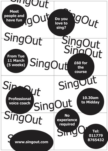 This is a test concept… I was imagining people running youth workshops – committed, cash strapped, time-poor people who would like a little simplicity. This picture is a rough idea of a poster but it is also the front of the A6 flyers.
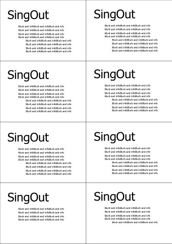
The theory is this – to make things simple there’s just one front – which is photocopied onto A3 paper as above. When you need flyers you take a poster and photocopy the information onto the back (left) and cut it up long the grid.
With a generous margin for mis alignment front and back this can make managing the demand for posters and/or flyers much easier. If the photocopying is donated for free then all posters could have the second side copied onto them so that there’s only one stock of materials – all posters can become flyers.
The result is that these are the 8 different flyer fronts…
 Each one is a fragment of the poster – slightly akin to the original Star Wars trading cards where some cards made up fragments of a larger picture and you had to collect all 9 fragments to make the whole.
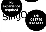
 As a traditional flyer this has its downside… the information on the front is only a fragment and may not make sense.
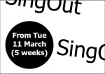 The upsides are: in terms of pragmatic reproduction the staff get it easy. The very chaotic nature of the design may attract people because it’s a puzzle to solve – we humans love a puzzle.
 It could go wrong and not matter – the photocopying part can be difficult to get right – especially if the original is an A4 sheet that is scaled up to A3. Borders are often introduced where the photocopier tries to be helpful – to fit everything within the pint margins.
 As there will be print margins (white edges to the A3 sheet that cannot be printed upon) the design needs to allow for this.
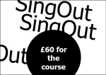
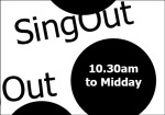 This fragment is particularly interseting – it only shows a time of day and the words ‘SingOut’… but I challenge you to see this and not let your mind ask itself “What is at 10.30am to midday?”.
 Once your mind has asked that question to itself your attention has been caught.
 If the fragments of information appearing on each flyer piece are not a problem then it is the overall image that needs attention – it needs to look like a really great poster.


